Color is your brand’s silent language; it speaks to the subconscious, triggers emotions, sets expectations, and often directly influences the purchase decision. Choosing colors in packaging is far more than an aesthetic preference—it is a strategic decision that conveys your brand’s identity and promise in seconds.
This comprehensive guide explores the psychological power of colors and how you can leverage it on labels to your brand’s advantage.
The Language of the Subconscious: How Colors Speak to Our Brain
The effect of color is a blend of biological and cultural coding. Red’s associations with energy and danger; green’s with calm—these come from universal experiences in nature. In label design, the goal is to match your core brand message (reliable, natural, luxurious, energetic) with the right color codes.
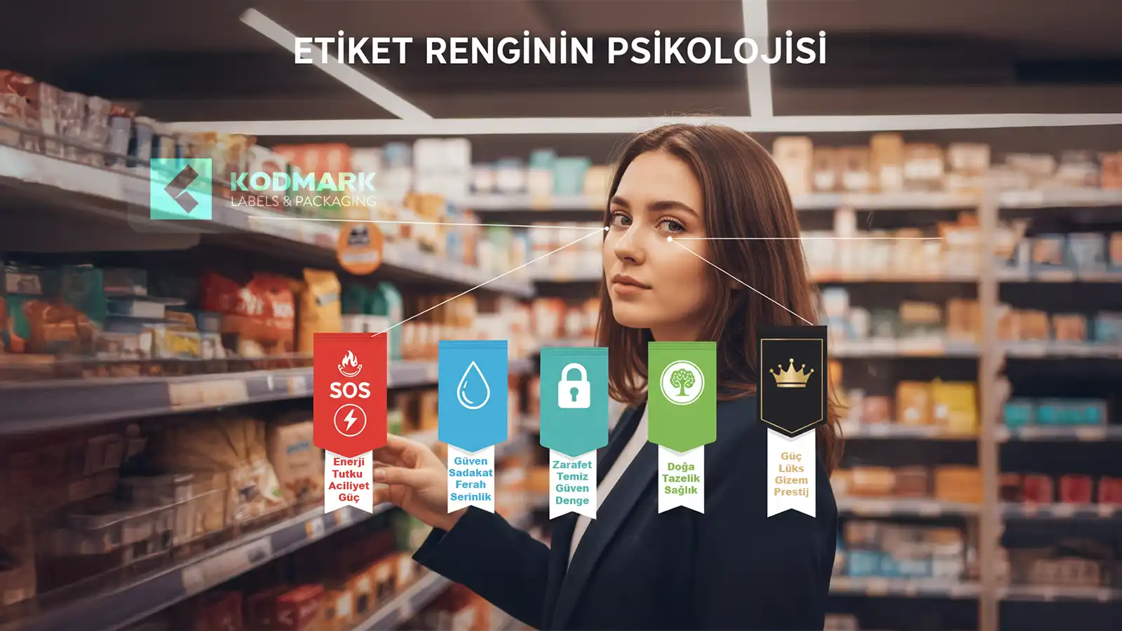
The Meanings of Colors: Your Strategic Shelf Palette
Red: Power, Passion, and Appetite
- Associations: Energy, urgency, appetite.
- Effect: Physiological stimulation; triggers impulse decisions.
- Use: Sauces, snacks, energy drinks; promotions/discounts.
- Pro tip: Use carefully in luxury/relaxation segments.
Blue: Trust, Calm, and Professionalism
- Associations: Trust, stability, hygiene.
- Effect: Calming, instills confidence.
- Use: Finance/technology; water/cleaning; healthcare.
- Pro tip: May suppress appetite in food; works well for light/diet concepts.
Green: Nature, Health, and Growth
- Associations: Freshness, sustainability, balance.
- Effect: Easy on the eyes; conveys naturalness.
- Use: Organic food, natural cosmetics, vegan/eco products.
- Pro tip: Shade matters: pistachio = freshness, emerald = prestige.
Black: Luxury, Elegance, and Authority
- Associations: Exclusivity, power, mystery.
- Effect: Instant premium feel.
- Use: Luxury cosmetics/perfume, gourmet food, alcohol, high-tech.
- Pro tip: Matte black + gold/silver = quiet luxury.
White: Purity, Simplicity, and Modernity
- Associations: Cleanliness, honesty, minimalism.
- Effect: Freshness; highlights with negative space.
- Use: Dairy, medical/pharmaceutical, sensitive skincare, technology.
- Pro tip: Combine with a vibrant accent color for greater impact.
Colors Don’t Work Alone: The Power of Combination and Context
- Storytelling through combinations: Green+brown = “natural/organic”; black+gold = “accessible luxury”; blue+white = “clean & trustworthy.”
- Category codes vs. differentiation: Analyze competitor palettes; decide whether to aim for alignment or stand out.
- Target audience: Young = bold/energetic; Mature = sophisticated/balanced palettes.
Design & Printing Tips for Application
- Color accuracy: Define brand colors via CMYK/Pantone; use digital printing profiles for wide gamuts.
- Material effect: Paper vs film (PP/PE/PET) surfaces change perception (matte = sophisticated, glossy = vibrant).
- Premium highlights: Foil/emboss/spot varnish to create focal points.
- Transparent packaging: No-label look requires opaque white backing.
Conclusion: Color is the Heart of Your Strategy
Label color is a fundamental part of brand strategy; the right palette enhances recognition and influences purchasing decisions. At Kodmark, advanced color management and cutting-edge digital/flexo ensure color consistency in every print.
Let your brand speak the right color: contact our experts.
Related reads: 2026 Label Trends · No-Label Look & Premium Finishes · Prepress Checklist