Poor preparation can lead to costly issues: faded colors, unreadable text, and cutting errors. That’s why you should always double-check these 10 steps before sending files to print.
1) Not Adding Bleed
Why? Even slight cutting shifts create white edges. Solution: Add at least 3 mm bleed on all sides.
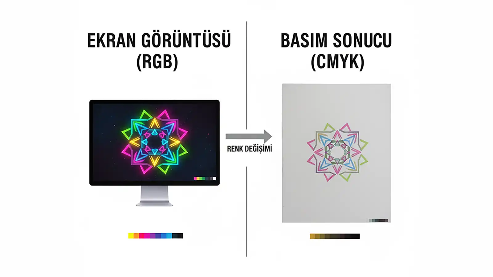
2) Wrong Color Mode (RGB → CMYK)
Why? RGB on screen is different from CMYK in print. Solution: Start your project in CMYK from the beginning.
3) Low-Resolution Images
Solution: Photos should be 300 DPI; logos/illustrations should be vector (.ai/.eps/.svg).
4) Not Outlining Fonts
Solution: Convert all text to outlines.
5) Not Using Rich Black
Solution: For large black areas, use e.g. C40 M30 Y30 K100.
6) Ignoring the Safe Zone
Solution: Keep important elements at least 3–4 mm inside the cutting area.
7) Incorrect Spot (Pantone) Color Setup
Solution: Define Pantone colors as Spot Colors.
8) Not Separating Die Line
Solution: Place the die line on a separate layer/spot color with overprint enabled.
9) Overlooking Overprint Settings
Solution: Check overprint for small black text.
10) Wrong File Format
Solution: Save print files as PDF/X-1a or PDF/X-4.
Conclusion
These technical steps aren’t here to limit your creativity, but to make sure your vision prints exactly as intended. Get in touch with our prepress team and let’s check your file together.